Pricing Card Uplift

Company

Hostinger

My Role

UI/UX Designer

Date

January 2024

Overview
The Pitch
Our pitch was to enhance the user experience and conversion rates on our homepage by redesigning the pricing cards. The existing pricing cards were identified as a key area for improvement due to their extensive feature lists. These issues were leading to user confusion and a lack of clarity about what each plan offered, which in turn was impacting user decision-making and ultimately, conversions.
Key issues were addressed:

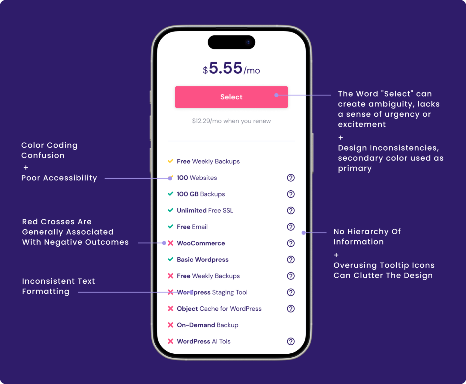
Extensive Feature List: The original pricing cards contained an overwhelming number of features, making it difficult for users to quickly understand the benefits of each plan.


Vague Descriptions: The descriptions of the plans and their associated features were unclear, requiring users to be tech-savvy.

It was very hard to “scan” the difference of the plans, feature-wise.


Inconsistent Design: Visual inconsistencies across the pricing cards contributed to a lack of professionalism

Research & Insights

Preparation before the Pitch

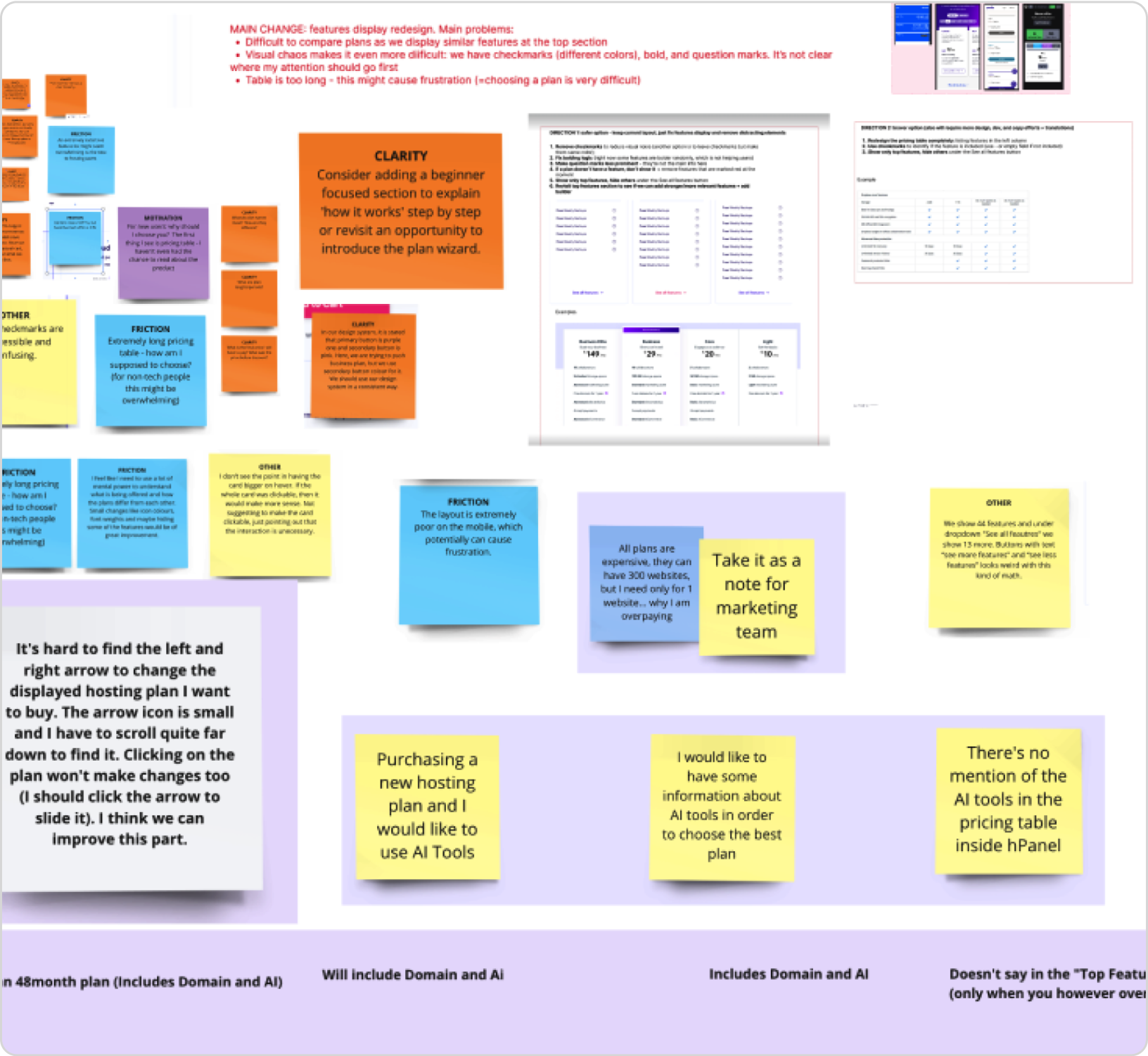
Before presenting the pitch to redesign the pricing cards, a thorough research process was undertaken to uncover critical usability and design issues. This involved gathering quantitative and qualitative data to better understand user behavior, pain points, and opportunities for enhancing the overall user experience and improving conversion rates.
UX Heuristic Analysis
A UX heuristic analysis identified usability issues in the pricing cards by evaluating them against Jakob Nielsen’s 10 Usability Heuristics.
A/B Testing
Previous tests were analyzed to determine the impact of different design elements on user behavior.
Hotjar Recordings
User interaction recordings provided insights into how users navigated the pricing section and where they experienced confusion or hesitation.
Internal Exploratory Sessions
During these sessions, colleagues frequently commented on the poor information hierarchy and the unclear presentation of features.
CRO Team Insights
CRO team had previously gathered feedback from customer service interactions. These insights helped pinpoint user concerns related to the pricing card, especially in terms of clarity and hierarchy.
Competitor Analysis
We also analyzed best practices from competitors to gather ideas on how to improve our pricing cards and make them more user-friendly and conversion-driven.
Hypothesis
Combination of a shorter pricing table, design, UX and copy improvements addressing clarity and plan differences, will increase CR%, because we will eliminate anxiety and help users make their decision faster.
Design Refinement
Redesign Highlights
Features Aggregation for Clarity

Conducted an in-depth competitor analysis, and each product manager carried out their own market research. Based on these insights, they chose to highlight only the most compelling features of their product, rather than presenting an exhaustive list of everything we offer.

Action-Oriented Plan Descriptions
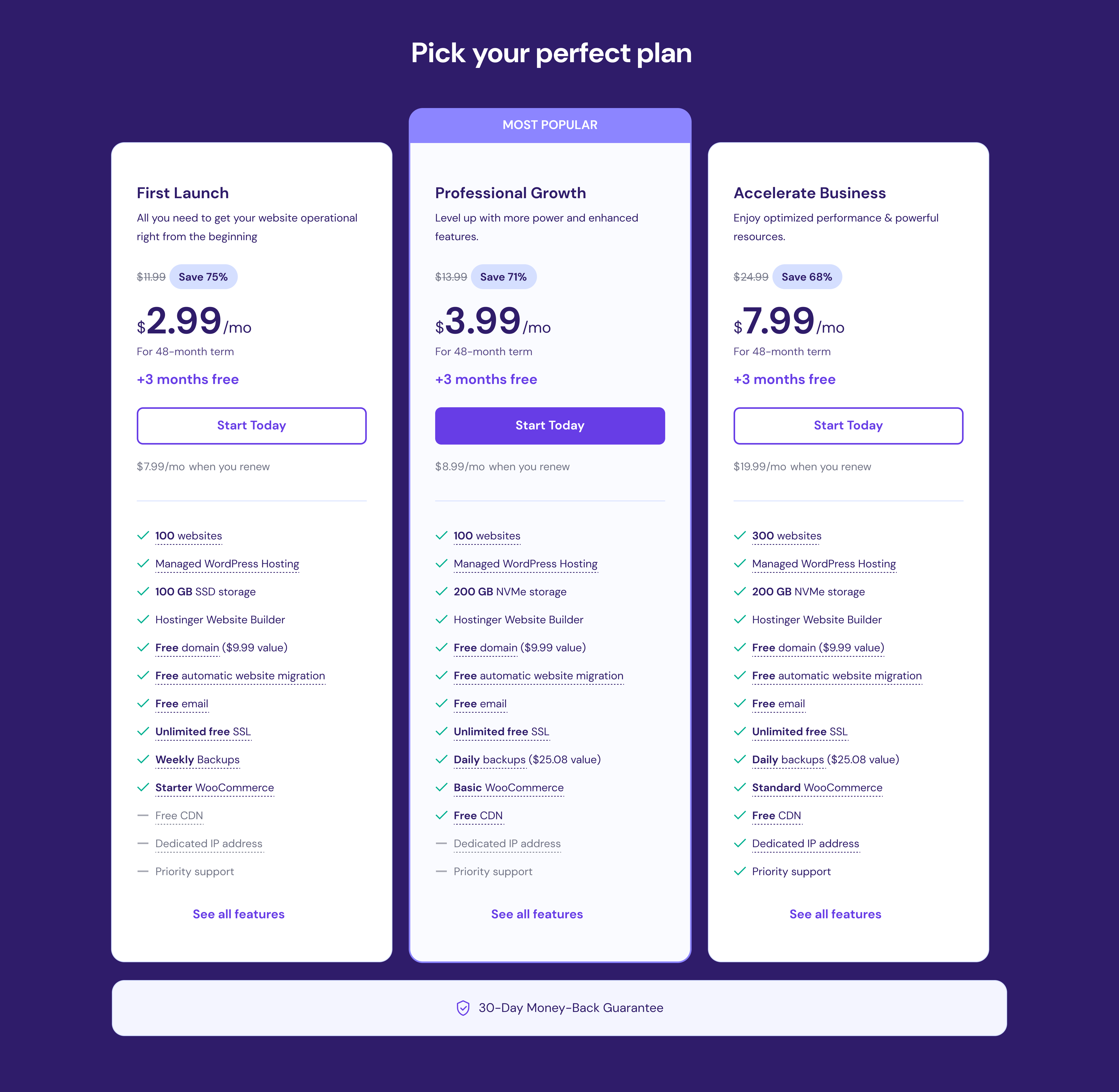
The plan names were updated to better reflect the target audience and the benefits of each plan. For example, “Business” was replaced with more specific and appealing titles that communicated the plan’s value. Plan descriptions were revised to be more direct and actionable.
Consistent Visual Hierarchy

We established a consistent visual hierarchy across all pricing cards, ensuring that key information such as plan names, prices, and call-to-action buttons were following guidelines of the brand, prominently displayed and easy to read.

Subtle, Informative Tooltips
Minimizing visual noise while remaining intuitive. They provide detailed information in a user-friendly manner, without requiring additional clicks.

I ensured all pricing cards had a clear visual hierarchy and aligned with brand guidelines.

Clear and intuitive tooltips, they present detailed information without extra clicks.

Each product manager conducted market research and focused on highlighting their product’s most compelling features, informed by a competitor analysis.

Plan names were updated to better align with the target audience

See how it Works
A/B Test
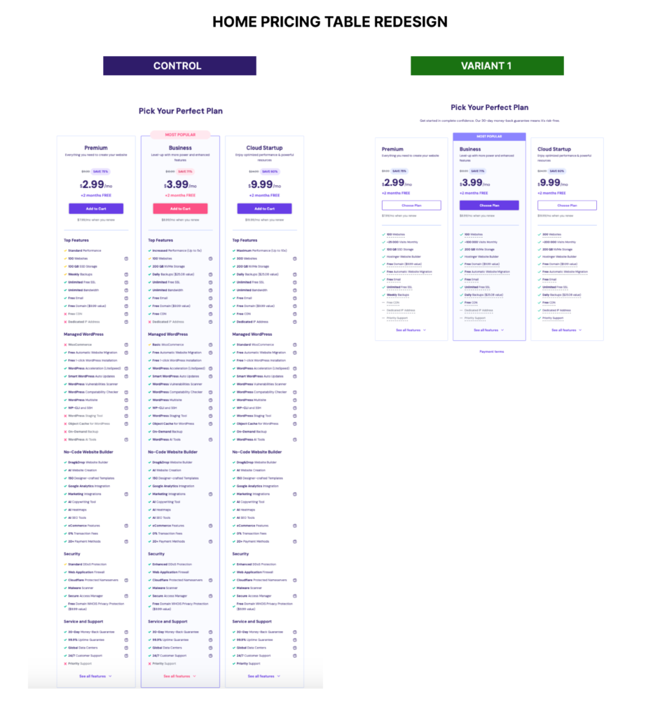
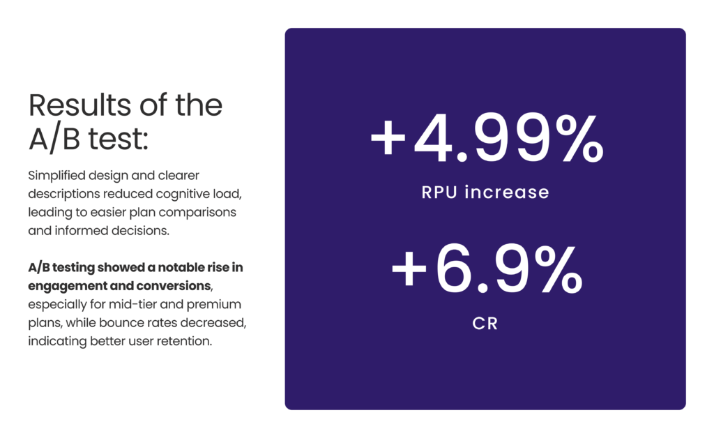
This A/B test was conducted on the homepage over a 14-day period. The test compared the current pricing table with a redesigned variant. The redesign included several key improvements: enhanced design elements such as colors and alignment, UX improvements like better tooltip placement and a shorter table layout, and copy enhancements including a new subheadline, reorganized features, and updated call-to-action (CTA) text.
Conclusion:
The uplifted pricing cards on our homepage successfully addressed the key issues identified in our research. By simplifying the feature lists, clarifying plan descriptions, and ensuring design consistency, we were able to create a more user-friendly and conversion-oriented experience. This redesign not only improved user satisfaction but also contributed to a measurable increase in conversions, validating the effectiveness of our approach.